How can I see when my employees log in and out?
The system has a Time Clock feature that requires your employees to have PIN codes saved in their Us
Enter whatever you're curious about and we'll give you a smart summary of the best answers as well as relevant articles.
 December 16, 2025
The Sales Comparison Report helps you analyze sales performance between two different time periods that can go back years. It displays key sales metrics, item-level details, and clear comparisons that highlight growth or decline over time. This report is ideal for spotting trends, evaluating department or vendor performance, and making informed business decisions.
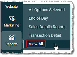
To get to this area, in the main system menu hover over Reports and click View All.
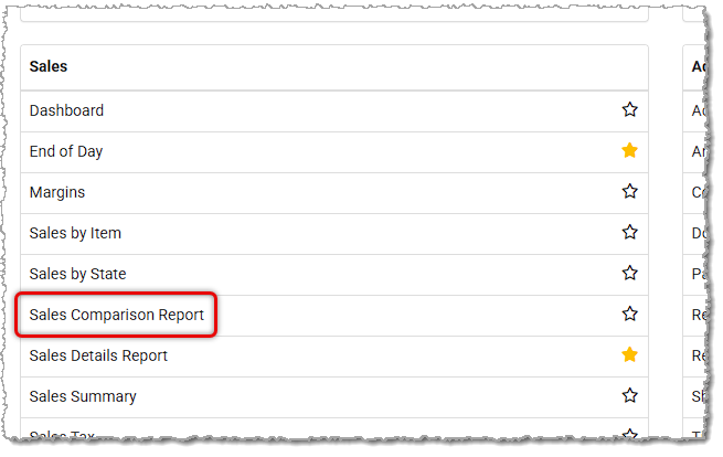
On the main Reports page, find the Sales Reports section and click to open the Sales Comparison Report.
The report is divided into four main sections:
This section controls which sales data is included in the report and the timeframe of those sales. Initially, no data is loaded when the report is first opened. This is to save time and increase performance if the default date selected is not desired. With this report you are able to compare sales data from the past 365 days with sales from as far back as the previous calendar year, if needed.
To configure the report for this comparison, do the following steps:
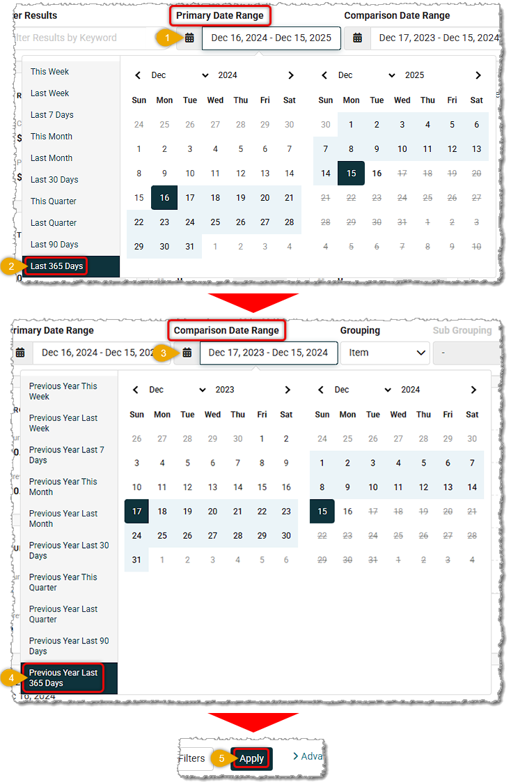
The Primary Date Range represents the most recent or current time period you want to analyze. Examples include: This Month, This Quarter, This Year, or a Custom Range. In most cases you will want to select a range within the current year.
The Comparison Date Range is used to compare results against the Primary period. This automatically defaults to the same time period from the previous year for you. Examples include: If the Primary range is October 2025, the Comparison range will be October 2024. This automation saves time and reduces errors when setting up comparisons.
The report is capable of working with sales data in custom date ranges going back up to three full years.
Grouping and Sub-Grouping Filters
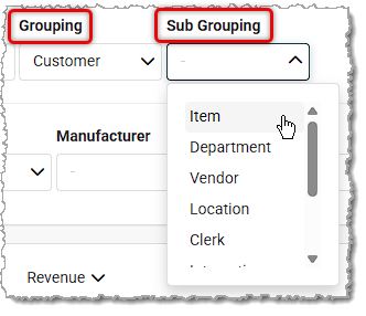
These filters determine how sales data is organized in the table:
Example:
If we set the Group to Department and the Subgroup to Vendor, then click the Apply button, the report will show totals by Department, then by Vendor within each Department, and finally it will list individual items.
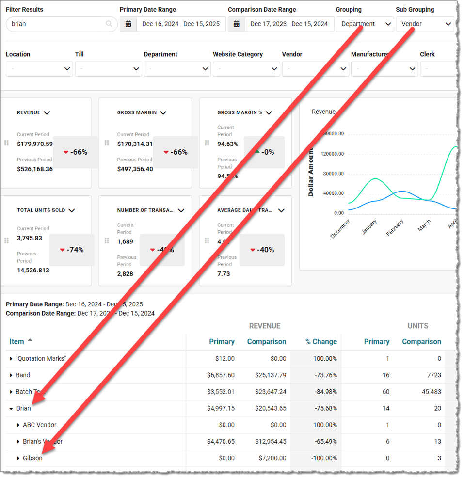
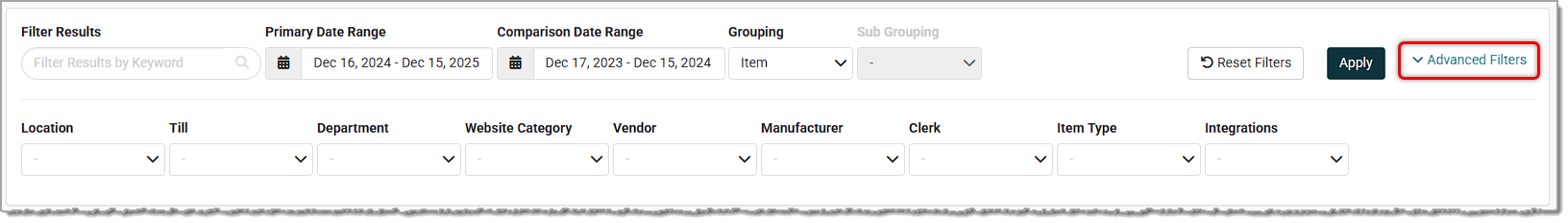
Advanced Filters
If you click the Advanced Filters link on the right side of the Filters area, you'll see filters for Location (If you have multiple Locations, by default the report uses data from all of them), Till, Department, Website Category, Vendor, Manufacturer, Sales Clerk, Item Type (e.g. Product & Service), and Integrations (e.g. Shopify & Clientbook).
Located below the filters, the Key Metrics section displays high-level performance metrics in an easy-to-read card format.
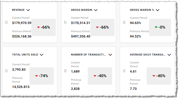
Each card (or “tile”) represents a metric and can be changed to a different metric than the default one by using the down-arrow button in the upper right. You can also used the handle icons on the left to drag and drop the cards into whatever positions work best for you. These metrics take into account the time period you selected as well as any additional filters you might have applied.
Available Metrics:
The Metrics Chart area provides a visual comparison of sales performance over time for your Revenue (this displays by default), Units Sold, Gross Margin, or Number of Transactions metrics.
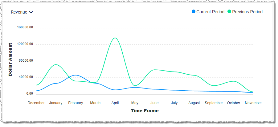
Dynamic Line Charts Deliver Comparative Insights:
Metric Selection:
The lower section of the report displays a detailed comparison breakdown for the Primary and Comparison periods for their Revenue, Units, and Margin, based on the selected filters.
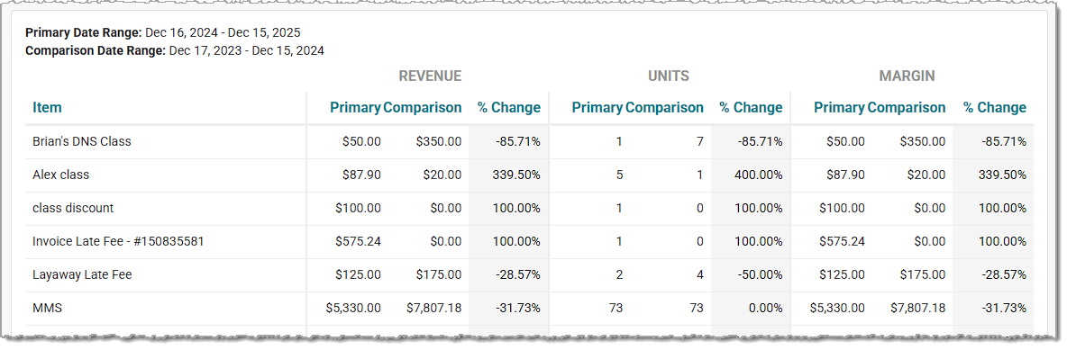
It shows data for both time periods, along with a comparison metric that highlights percentage growth or decline over the periods.
Each row typically includes:
• Group/Subgroup Totals
• Item-Level Details
• Primary Period Metrics
• Comparison Period Metrics
• Change (%) indicating increase or decrease between periods
Is this page helpful?
×Help us improve our articles